MY ROLE
TOOLS USED
UX Strategy, User Research, Branding, UI Design
Adobe Illustrator, Figma, InVision, Usability Hub, Google Forms
PROBLEM
SOLUTION
The client asked me to create a cloud storage and organization product. This meant that I needed to design a cloud storage application with a definitive audience and clear branding. This product needed to fill a void, and I found that void to be a need for organizing and coordinating vacations and trips with multiple people.
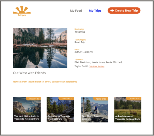
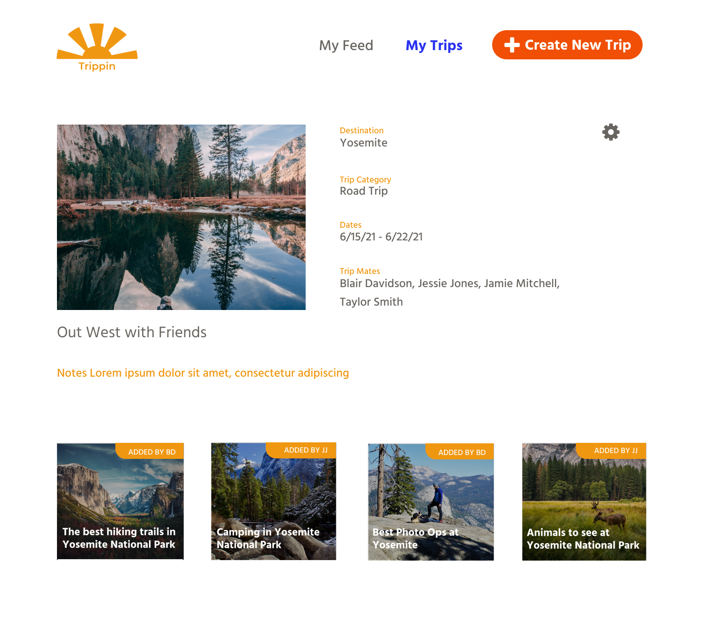
Trippin allows travelers to store all their trip-related content. Users can find content related to trip activities, add it to a trip, and see what their fellow trip mates have added as well.
___
USER RESEARCH
I started off the process with a survey. I sent my survey to people that I know, but I made sure I sent it to a variety of ages and genders. I got 20 responses. Almost all survey participants had used a cloud storage product before. Many of them use more than one. Below is the breakdown for which products they use. Google Drive is the most used product, but Dropbox and iCloud are a close second. This tells me that most users are at least comfortable with the concept of cloud storage.
I also asked about categories of content which received some interesting answers. People mostly wanted to store photos and documents. I got a very interesting write-in response though. Someone said they would want to store planning docs for vacation or budgeting. That could potentially encompass both documents and photos but have a clearer focus.
COMPETITIVE ANALYSIS
As previously mentioned the competitive landscape for cloud storage has some very big players. I looked at Google Drive, Pinterest, and Evernote to get a better sense of what current players were doing in the space. Pinterest is a really great aspirational product, which is what I wanted for a cloud storage application for travelers since planning trips is inherently aspirational. Google Drive really has collaboration down, but obviously it requires everyone to have a Google account. Evernote is has super easy to understand notebook style format, but requires users to download the Evernote app.
Personas
I developed 2 personas for this project. You can think of them as the person that plans or even over-plans vacations and the person that is just sort of along for the ride. These people are different but both like traveling.
___
User flows
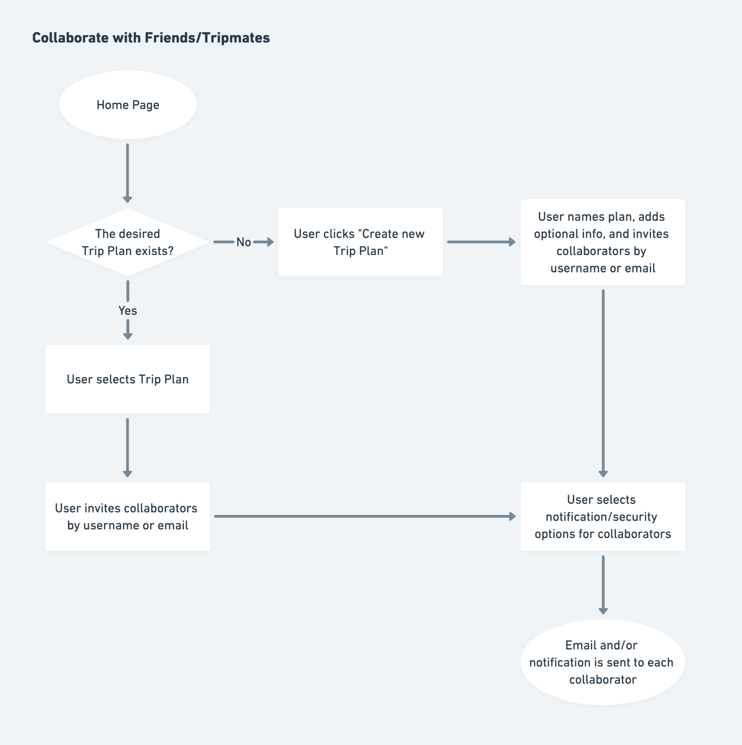
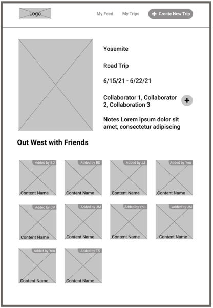
I created three user flows to encompass user stories around logging in or creating an account, saving and storing travel-related content, and collaborating on trip planning with others. These flows represent all the functionality for the entire application.
___


Wireframes
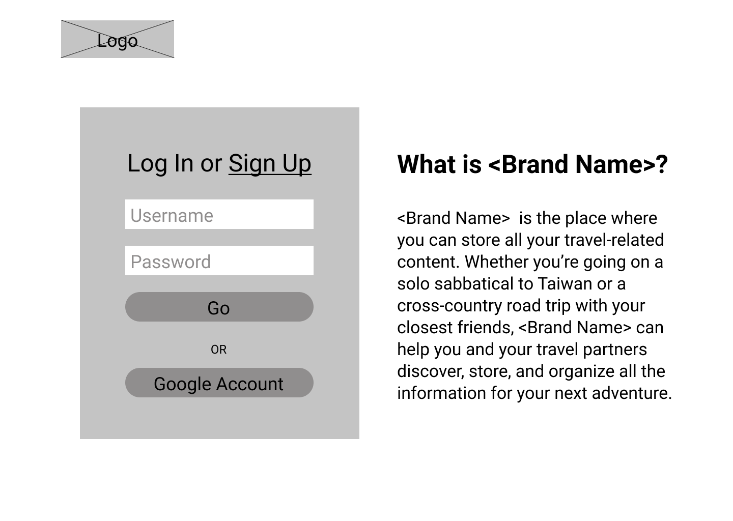
CREATE ACCOUNT / LOG IN
SAVE TRAVEL CONTENT
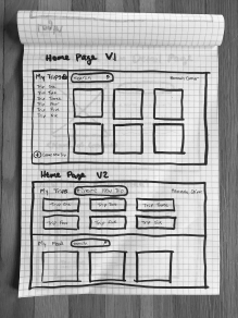
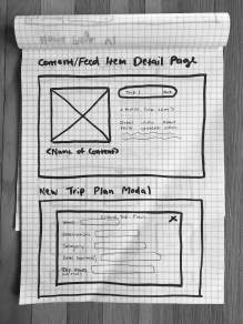
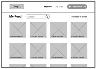
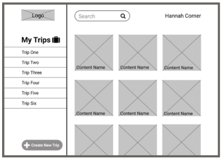
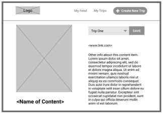
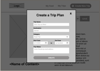
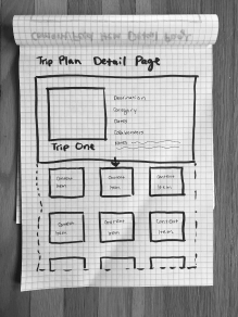
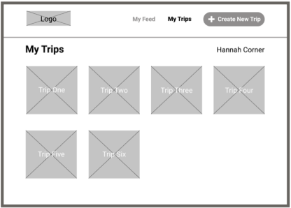
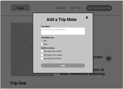
COLLABORATE WITH FRIENDS
Branding
What could be more cheery than a yellow sun? I wanted the logo to have a 1970s feel to match the name of the app. The font that goes with the logo is Montserrat. The semibold weight of the font matches the logo and the fact that it is sans serif keeps the look clean and crisp.
USABILITY TESTING
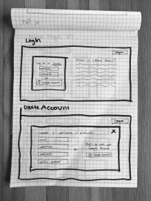
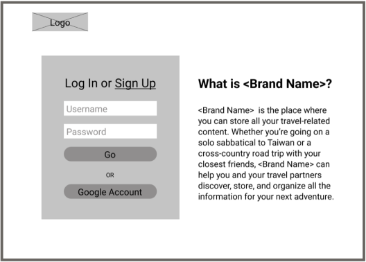
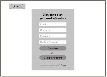
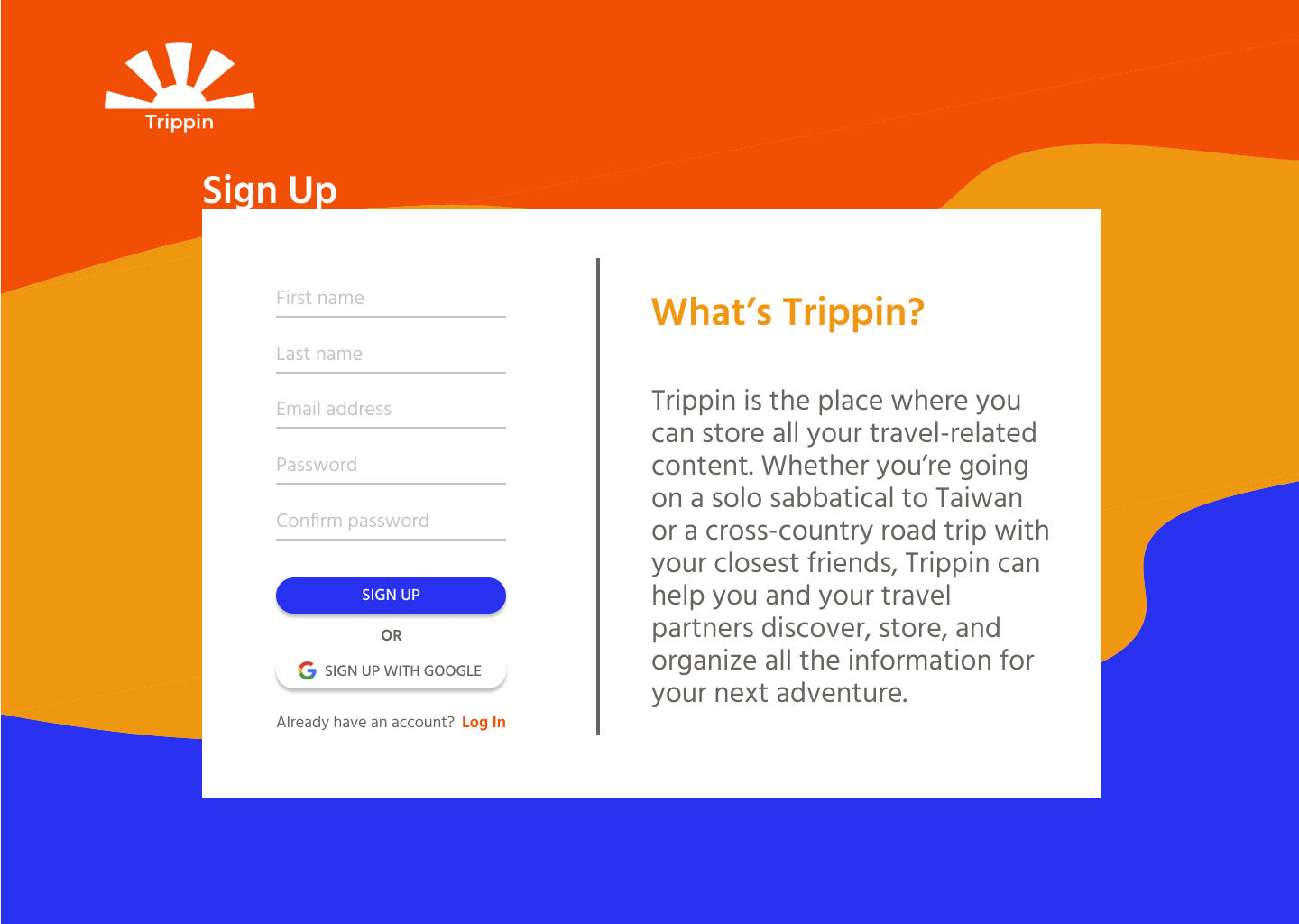
With the wireframes above, I conducted a first round of task-based usability testing. The test had four tasks and I did both remote and in-person tests. This resulted in four major changes to the wireframes. At this stage I also applied the branding to create higher fidelity mockups.
___
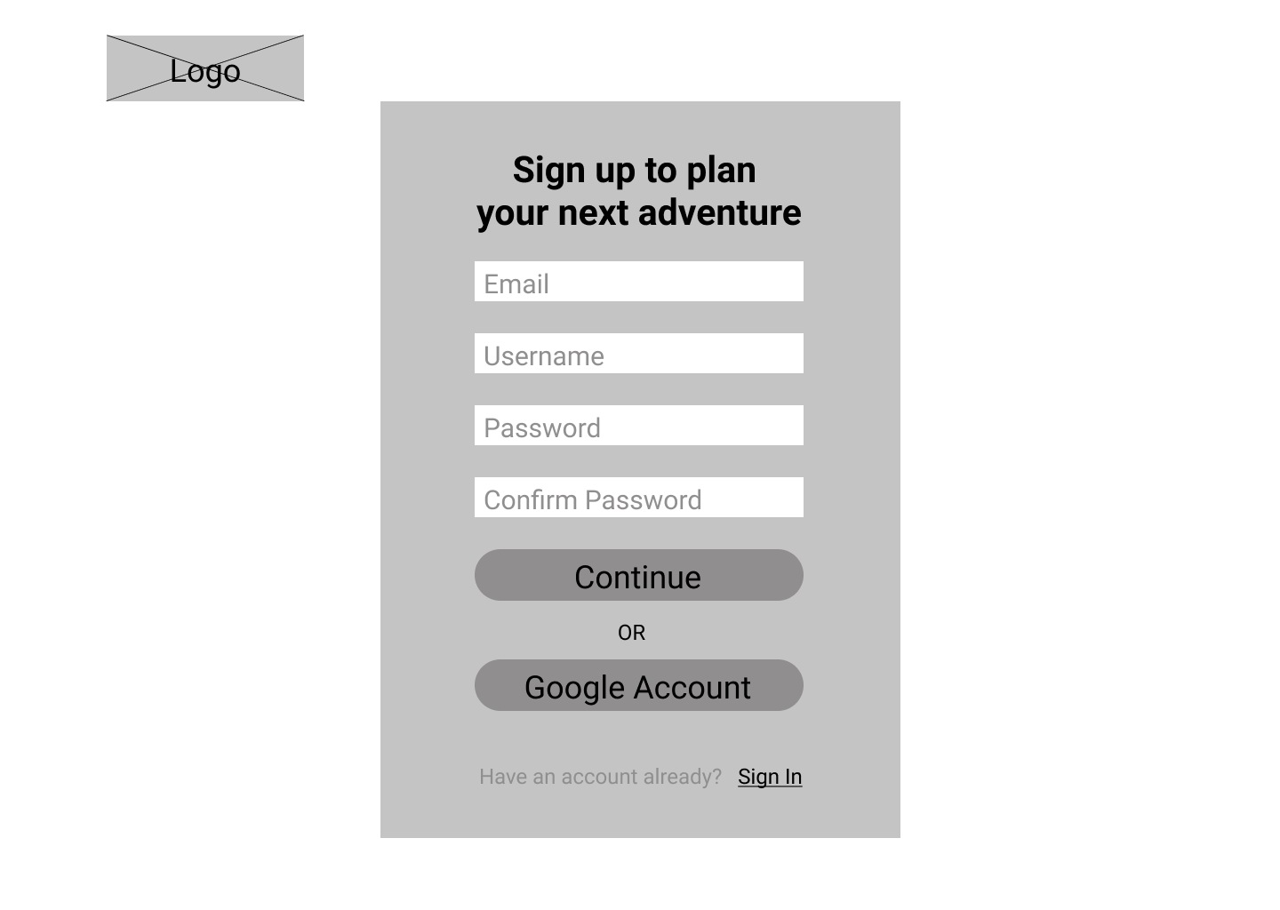
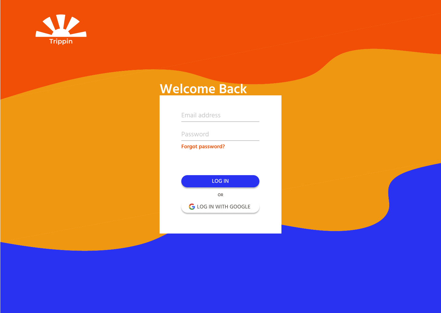
START WITH “SIGN UP” INSTEAD OF “LOG IN”
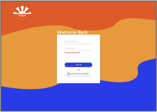
The first change was to start with the Sign Up page instead of a login page. Test participants commented that they would hardly ever need the log in page if they have their browser save their passwords.
REMOVE THE USERNAME FIELD
The next change came from many test participants being confused when they had to enter a username. Some people weren’t sure what contect the username would be visible in and we’re sure what was appropriate. Sticking with email and password simplified things and removed the source of confusion.
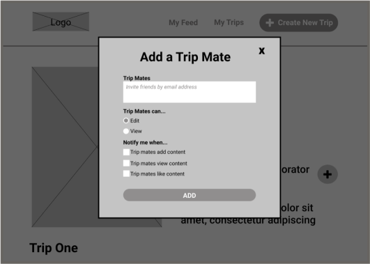
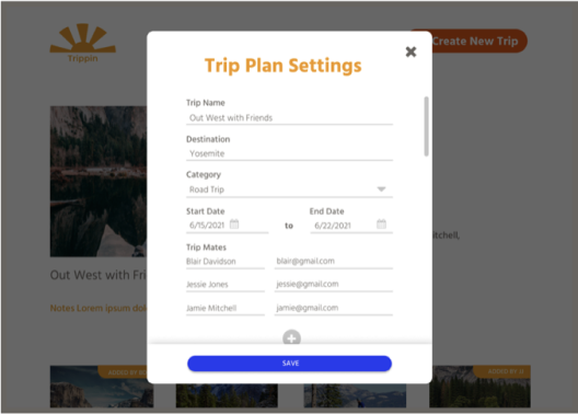
NEED A WAY TO CONNECT FRIENDS’ NAMES TO EMAIL ADDRESS
Another change I made came from a test participant asking how the application would know what email address belongs to what person. To remedy this I made the form in the Add a Trip Mate modal much more detailed.
I also did some preference testing using Usability Hub. The results led me to change the background of the log in/sign up page and the access style to edit trip details.

FINAL ITERATION
I did a third round of usability testing on the prototype with branding and made a few more tweeks, like making home feed feel less like advertisements and adding a new trip to the beginning of the list of trips, to arrive at the final version of the prototype.
